

Are you struggling to make your website look great on every device? Responsive website design is the key to giving your visitors a smooth, enjoyable experience no matter if they’re on a phone, tablet, or desktop.
When your site adapts perfectly to any screen size, you keep your audience engaged and increase your chances of turning visits into sales. Imagine having a powerful online store that not only looks stunning but also works flawlessly everywhere. That’s exactly what you get with Shopify, the No.1 eCommerce platform trusted by businesses of all sizes. Ready to discover how responsive design can transform your website and boost your business? Keep reading to find out how to create a site that truly connects with your visitors.
Introduction To Responsive Website Design
Responsive website design means creating websites that look great on all devices. From desktops to smartphones, the site adjusts automatically. This design method is essential today because people use many device types to browse the web.
Responsive design helps businesses reach more users and keeps visitors engaged. It creates a seamless experience no matter the screen size or resolution. This section explains what responsive design is, why it matters, and its role in modern web development.
Understanding Responsive Design And Its Importance
Responsive design uses flexible layouts, images, and CSS media queries. It allows websites to adapt to various screen sizes. The goal is to provide easy reading and navigation without resizing or scrolling.
- Flexible grids: Layout adjusts based on screen width.
- Responsive images: Scale properly to fit different screens.
- Media queries: CSS rules that apply styles based on device features.
Importance of responsive design:
- Improves accessibility for all users.
- Boosts search engine rankings.
- Reduces bounce rates by enhancing usability.
- Supports future devices with varying screen sizes.
How Responsive Design Enhances User Experience
User experience improves with responsive design because the site is easy to use on any device. Visitors find content faster without zooming or scrolling horizontally.
Benefits include:
| Feature | Benefit |
|---|---|
| Consistent navigation | Users can find menus easily on all devices |
| Readable text | Text adjusts size for clear reading |
| Fast loading | Optimized images and code improve speed |
The Role Of Responsive Design In Modern Web Development
Modern web development focuses heavily on responsive design. It is a standard practice, not an option.
Developers use responsive frameworks and tools to build flexible websites. This approach saves time and effort by creating one site for all devices.
- Reduces maintenance cost by managing a single codebase.
- Improves compatibility with various browsers and devices.
- Supports SEO best practices with mobile-friendly design.
Platforms like Shopify offer built-in responsive themes. This helps online businesses create stores that work well everywhere.
Key Features Of Responsive Website Design
Responsive website design ensures a seamless user experience on all devices. It adjusts the layout and content based on the screen size and resolution. This flexibility helps websites look great and work well on desktops, tablets, and smartphones.
Understanding the key features of responsive design reveals how websites stay user-friendly and visually appealing. These features include flexible layouts, adaptable images, style adjustments, and touch-optimized navigation.
Fluid Grids: Creating Flexible Layouts For All Devices
Fluid grids use relative units like percentages instead of fixed pixels. This approach allows the website layout to stretch or shrink smoothly across different screen sizes.
- Elements resize in proportion to the screen width.
- Maintains the design’s structure without breaking.
- Supports a consistent look on mobile, tablet, and desktop.
This flexibility avoids horizontal scrolling and ensures content fits perfectly on any device.
Flexible Images And Media: Ensuring Visual Consistency
Images and media must adapt to the container size to avoid distortion or overflow. Using CSS techniques like max-width: 100% keeps images responsive.
- Images scale down but never exceed their container.
- Maintains aspect ratio to prevent stretching.
- Supports various media types, including videos and SVGs.
Flexible media enhances visual consistency and improves page load times.
Media Queries: Adapting Styles To Different Screen Sizes
Media queries allow websites to apply specific CSS rules based on device characteristics. These include screen width, resolution, and orientation.
@media (max-width: 768px) { / CSS rules for tablets and smaller devices / body { font-size: 16px; } }This technique customizes font sizes, layouts, and visibility to fit each device perfectly.
Touch-friendly Navigation: Improving Mobile Interactions
Navigation must be easy to use on touchscreens. Responsive design includes large buttons and clear menus for fingers.
- Clickable areas are big enough to avoid tapping errors.
- Menus adapt into dropdowns or hamburger icons on small screens.
- Swipe gestures and touch events improve usability.
Touch-friendly navigation makes browsing smooth and frustration-free on smartphones and tablets.
How Responsive Design Boosts User Engagement
Responsive website design adapts to different screen sizes and devices.
This flexibility improves how users interact with your site.
Visitors stay longer, explore more, and return often.
Responsive design creates a smooth and pleasant experience.
Faster Load Times And Reduced Bounce Rates
Responsive websites load quickly on all devices.
Faster load times keep users from leaving early.
Reduced bounce rates mean visitors stay and engage.
- Optimized images and code adjust for device speed.
- Less waiting time improves user satisfaction.
- Search engines favor fast-loading websites.
Improved Accessibility Across Devices
Responsive design works on phones, tablets, and desktops.
Users can access your site anytime, anywhere.
Easy navigation and readable text improve usability.
- Touch-friendly buttons on mobile devices.
- Flexible layouts that fit any screen size.
- Consistent experience across all platforms.
Consistent Branding And Visual Appeal
Responsive design keeps your brand look uniform.
Colors, fonts, and images adjust smoothly to screens.
Consistent branding builds trust and recognition.
| Aspect | Benefit |
|---|---|
| Logo and Colors | Remain clear and vibrant on all devices |
| Typography | Easy to read, enhancing user comfort |
| Images | Scale properly without distortion |
Enhanced Conversion Rates Through Better Ux
Good user experience leads to more sales and sign-ups.
Responsive design improves navigation and interaction.
Clear calls to action work on any screen size.
- Users complete purchases faster.
- Forms are easier to fill out.
- Shopping with platforms like Shopify is seamless.
Better UX means visitors trust and prefer your site.

Credit: www.icore.net.in
Pricing And Affordability Of Responsive Web Design Services
Responsive web design ensures your website looks great on all devices. Pricing for these services varies widely. Understanding the costs helps you choose the best option for your budget. Affordable solutions exist for every business size.
Cost Factors Involved In Responsive Design Projects
Several elements affect the cost of responsive design projects. Key factors include:
- Design complexity: More features and custom layouts increase costs.
- Number of pages: More pages require additional time and resources.
- Developer expertise: Experienced designers charge higher fees.
- Content creation: Writing and media production add to the price.
- Testing and optimization: Ensuring compatibility across devices requires effort.
Costs can range from a few hundred dollars for simple sites to several thousand for advanced designs.
Comparing Diy Tools Vs Professional Design Services
| Aspect | DIY Tools | Professional Services |
|---|---|---|
| Cost | Low monthly fees or free | High one-time or hourly fees |
| Customization | Limited templates and features | Fully tailored to your needs |
| Technical skills | Minimal required | Handled by experts |
| Time investment | You build and manage | Faster delivery by pros |
| Support | Basic or community support | Dedicated professional support |
Budget-friendly Solutions For Small Businesses
Small businesses can access affordable responsive design options. Consider these approaches:
- Use platforms like Shopify that include responsive templates.
- Start with simple designs and add features over time.
- Choose pre-built themes to save on design costs.
- Take advantage of free or low-cost DIY tools for initial setup.
- Hire freelancers for specific tasks instead of full projects.
These strategies help maintain a professional look without overspending.
Pros And Cons Of Implementing Responsive Website Design
Responsive website design adapts your site to different screen sizes and devices. It improves how visitors experience your website. Yet, it also comes with some challenges. Understanding the pros and cons helps in making smart design choices.
Advantages: Flexibility, Seo Benefits, And User Satisfaction
Flexibility means the site works well on phones, tablets, and desktops. One design fits all devices, saving time and effort.
- Automatically adjusts layout and images
- Supports new devices without extra coding
- Easy to update content once for all screens
SEO Benefits boost your site’s visibility on Google and other search engines.
- Google prefers mobile-friendly sites
- Single URL avoids duplicate content issues
- Faster load times improve rankings
User Satisfaction grows with a smooth browsing experience.
- Easy navigation on any device
- Consistent look and feel
- Improved engagement and lower bounce rates
Challenges: Development Complexity And Maintenance
Development Complexity can increase project time and cost.
- Requires careful planning of layouts and breakpoints
- Needs thorough testing on many devices
- Designers and developers must collaborate closely
Maintenance demands ongoing attention.
- Fixes must work across all screen sizes
- Updates can be harder than fixed-width sites
- More time needed for quality assurance
Balancing Design Quality With Performance
High-quality design often adds large images and scripts.
Performance means pages load fast and run smoothly.
| Aspect | Design Quality | Performance |
|---|---|---|
| Images | Use high-res and detailed visuals | Optimize size and use lazy loading |
| Scripts | Interactive features and animations | Minimize scripts and defer loading |
| Fonts | Custom fonts for brand identity | Limit font weights and styles |
Good responsive sites find a middle ground. They keep the design attractive but load quickly.
Shopify supports responsive design to help businesses create fast, flexible online stores. It balances style with performance to reach more customers.

Credit: www.dynamicdreamz.com
Ideal Users And Scenarios For Responsive Website Design
Responsive website design fits many users and situations. It ensures websites work well on all devices. This design style adapts layouts to screens of different sizes. It makes user experience smooth and consistent.
Various businesses and platforms benefit from responsive design. It helps reach wider audiences and keeps visitors engaged. Below are key users and scenarios where responsive design excels.
Businesses Targeting Multi-device Audiences
Businesses with customers using many devices need responsive design. People browse websites on phones, tablets, and desktops. Responsive design ensures content looks good on all.
- Better user experience on any screen size
- Higher engagement by adapting to device features
- Consistent branding across multiple platforms
For example, a local service provider or a news site benefits by reaching users everywhere. Responsive design helps keep visitors longer and reduces bounce rates.
E-commerce Sites Needing Seamless Mobile Shopping
Online stores require smooth mobile shopping experiences. Many customers shop using smartphones. Responsive design adjusts product pages and checkout flows for easy use.
| Responsive Design Benefits | E-Commerce Impact |
|---|---|
| Fast loading times | Lower cart abandonment rates |
| Easy navigation | Improved sales conversion |
| Clear product images | Better customer trust |
Shopify is a top platform supporting responsive e-commerce sites. It helps sellers create mobile-friendly stores fast and easily.
Content-rich Platforms Requiring Adaptive Layouts
Websites with many articles, videos, or images need flexible layouts. Responsive design organizes content well on different devices.
- Adjusts text size for readability
- Resizes images to fit screens
- Rearranges menus and sidebars
This helps visitors find information without frustration. News sites, blogs, and educational platforms gain strong benefits from responsive layouts.
Startups And Entrepreneurs Seeking Scalable Solutions
New businesses need websites that grow with them. Responsive design offers scalability without costly redesigns.
- Works on any device from day one
- Saves time and money on updates
- Supports expanding content and features
Entrepreneurs using Shopify can easily start and expand online stores. Responsive design ensures a professional look and function at all stages.
Conclusion: Maximizing Engagement With Seamless Ux Through Responsive Design
Responsive website design ensures your site adapts smoothly to all devices. It creates a seamless user experience (UX) that keeps visitors engaged. A well-designed responsive site boosts interaction and reduces bounce rates.
Users expect fast, easy-to-navigate sites on phones, tablets, and desktops. Responsive design meets these needs by adjusting layouts and content dynamically. This flexibility drives higher satisfaction and encourages return visits.
Key Takeaways For Effective Responsive Design
- Flexible grids and layouts: Use relative units like percentages, not fixed pixels.
- Optimized images: Serve images sized for the device to speed up loading.
- Media queries: Apply CSS rules tailored for various screen sizes.
- Touch-friendly elements: Ensure buttons and links are easy to tap on small screens.
- Consistent navigation: Keep menus simple and accessible on all devices.
- Fast loading times: Minimize code and leverage caching to improve speed.
Future Trends In Responsive Web Design
| Trend | Description | Benefit |
|---|---|---|
| Progressive Web Apps (PWAs) | Apps that work like websites with offline capabilities. | Improved speed and usability on mobile devices. |
| Voice User Interface | Integration of voice commands in web navigation. | Easier access and hands-free browsing. |
| AI-Driven Personalization | Custom content based on user behavior and preferences. | Higher engagement through tailored experiences. |
| Advanced Animation & Microinteractions | Subtle animations that guide and delight users. | Enhanced user satisfaction and feedback. |
Actionable Tips To Get Started Today
- Test your site on multiple devices. Use emulators and real devices for accuracy.
- Use a mobile-first approach. Design for small screens first, then scale up.
- Compress images. Reduce file sizes without losing quality.
- Prioritize content. Show important information clearly and quickly.
- Choose a responsive platform. Platforms like Shopify offer built-in responsive templates.
- Regularly update your design. Keep up with new trends and technologies.
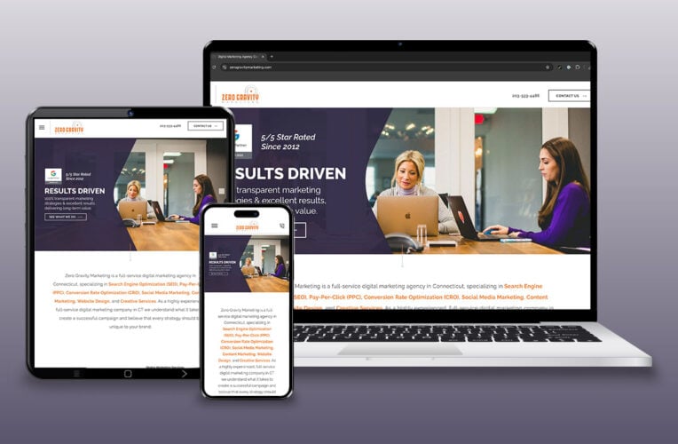
Credit: zerogravitymarketing.com
Frequently Asked Questions
What Is Responsive Website Design?
Responsive website design ensures your site adapts to all screen sizes. It improves user experience and accessibility across devices.
Why Is Responsive Design Important For Seo?
Responsive design boosts SEO by improving site speed and mobile usability. Google favors mobile-friendly sites in search rankings.
How Does Responsive Design Affect User Engagement?
Responsive design enhances user engagement by providing seamless navigation on any device. This reduces bounce rates and increases session duration.
What Are Key Elements Of Responsive Web Design?
Key elements include flexible grids, scalable images, and CSS media queries. These ensure your website adjusts smoothly to various screens.
Conclusion
Responsive website design ensures your site looks great on any device. It improves user experience and keeps visitors engaged. Faster loading times and easy navigation boost your search rankings. Mobile-friendly designs reach more customers and increase sales potential. Start building your online business with a trusted platform like Shopify. It helps you create a responsive, professional website without hassle. Keep your site adaptable and watch your business grow steadily.